
Built to be decoded instantly
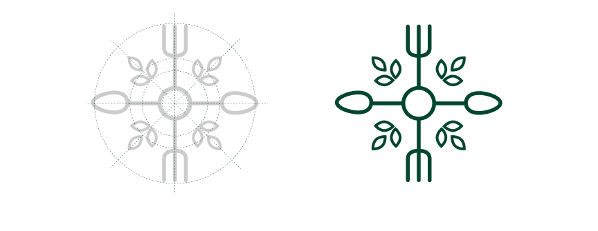
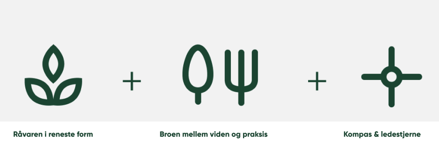
The logo needed to do one thing above all: communicate clearly and quickly to the everyday Dane. We stripped it back to what matters — a mark that feels organic, intuitive, and unmistakably rooted in food and nature.
No noise. Just signal.
Values you can see
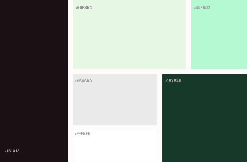
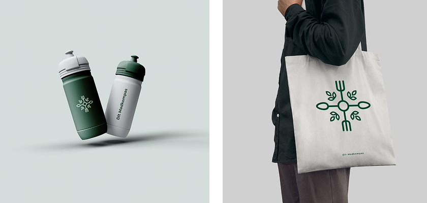
A brand identity isn't decoration — it's a statement. We built Dit Madkompas a visual world that reflects their core: transparency, simplicity, and a genuine care for what people put on their plates. Every colour, every typeface, every touchpoint earns its place.
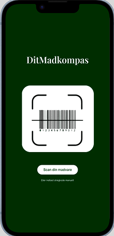
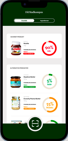
From concept to code
We built the first phase of the Dit Madkompas app from scratch — no templates, no shortcuts, just clean code and intentional design. From the brief, Dit Madkompas had a clear vision: keep it simple, keep it intuitive.
A light and effortless user experience in phase one was non-negotiable — so we let that drive every decision, from user flow to interface.
The result is a lean, purposeful foundation that's ready to scale and built to be taken further.